5 Tips for Designing a Call to Action Button That Converts
Most business websites have call to action (CTA) buttons. Unfortunately, those buttons often fail to compel visitors to take action.
When you’re designing or redesigning a site, provide a user-friendly interface that makes visitors want to interact with its bells and whistles—especially your CTA buttons. You may have put a lot of effort into great content that’s ranking well in search, but poor calls to action can waste a lot of that traffic.
Here are some quick design tips to help you craft CTA buttons that bring customers!
Make Sure Your Buttons Ask for Action!
Your site’s buttons are literal calls to action for your site’s visitors. Use verbs to prompt them to click on the buttons!
Buttons that just read “more information” or “email newsletter” don’t contain an actual action. Add simple verbs to prompt the user to do something. You might be surprised to know that some of the easiest, best-converting CTAs include:
- Sign Up
- Download
- Learn More
- Contact Us
Make Your Action Words Match the Voice of Sellers and Customers
When using action words on your CTA buttons, make it your goal to have your words apply equally to the voice of your brand as well as your customers.
Before you finalize your content on the button as yourself if these two phrases fit before what’s on your button:
- Would you like to…?
- I would like to…
Does the button text that follows fit in grammatically with both statements? If so, you have a CTA button on your hands that promotes a clear action!
Make Your Button Invitingly Clickable
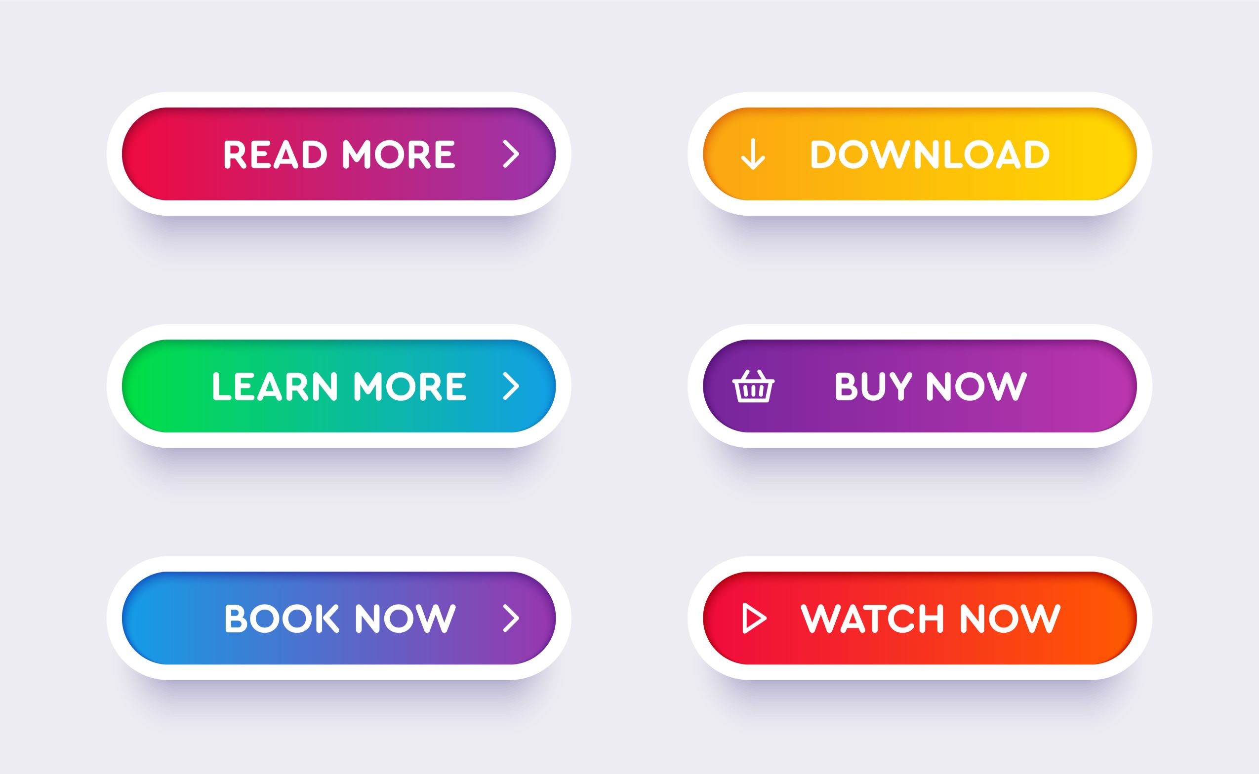
When designing your website, remember that your buttons’ physical appearance also matters. For starters, give your button a realistic look! Some ways to help a digital button register as something clickable with an online audience include:
- Making the button big enough to touch on a touchscreen device
- Giving the button the depth and shape of a realistic button
- Adding contrasting colors that make your button stand out from the rest of your website
Put Your Buttons in Smart Locations
Remember to place the buttons where your audience can easily access them and engage with your content. Regardless of how colorful or well-crafted your CTA button is if you make your audience scroll down to find it, you’re most likely not going to get the clicks you want.
Our advice is to place your buttons above the fold of your website and near where all of the important information is happening. When the benefits of your product or services are fresh in the minds of your audience, having a convenient, clear CTA button nearby will be the push they need to become a new customer for your brand.
You Don’t Need a Button for Everything!
When it comes to the button choices you offer site visitors, remember that less is best. Too many buttons can be overwhelming and counterproductive to your creating the buttons in the first place. Create buttons specifically for your most important services and keep the number to a minimum per page so that customers know exactly what to click on!
Design Your Site Down to the Button With Big D Creative
If you’re a new startup or simply a business that’s ready to undergo a site redesign, the designers at Big D Creative are ready to help you create a site that gets your brand noticed. Let us help you design a website with user-friendliness and search engine optimization in mind. Contact us today to learn more about our process and schedule your free consultation.


