7 Web Design Elements You Should Implement in 2019
2019 is here! It’s time to start making resolutions and sticking to them. As a business owner, one of the biggest steps towards improvement that you can take is the creation of a new site that promotes your brand. In a year of continued innovation in web design and digital marketing, here are seven design elements that can keep you on the cutting-edge:
1. Mobile-First Design
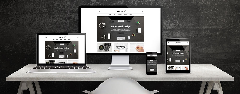
It’s no secret that most internet searches are made from mobile devices. Yet, many local businesses still fail to create sites in a mobile-friendly format. Google now ranks sites based on mobile, so consider starting your design process with mobile devices (“mobile first design”).
More and more B2C companies are taking advantage of the mobile-first movement as the percentage of consumers that look for products and services on mobile devices grows each year. When you create a site that is specifically geared towards mobile audiences (making it extra mobile-friendly), you have a higher chance of keeping your mobile visitors engaged and leading them towards your CTA and potential conversion. Your search rankings will improve for both mobile and desktop users!
2. Use of Chatbots
2019 is going to see the use of chatbots across sites. Over the last 20-years since their implementation, chatbots have evolved to now enhance the user experience and help with upfront customer service regarding general questions about your brand. Expect these features to become ever more prevalent as chatbots continue to evolve into a seamless experience that customers will look forward to.
3. Depth in Images
Many sites may boast that the future of web design is completely flat. However, one up and coming trend in the space is the addition of depth within images on a site. 3-D imagery creates realism to graphics that flat images simply can’t offer, while still making the experience fun and enticing for an audience.
4. Dependency on Several Design Elements
2019 is destined to showcase quite a few design approaches to websites. The type that suits your site ultimately depends on your brand. Some of the big trends to look out for in design will include fluid, flat, and minimalist approaches.
Fluid Design
Although the straight elements of flat design are still appealing, the fluidity of shapes and lines within site design is going to be a featured trend. By pulling from organic shapes and elements (i.e. circles, shapes found in nature like snowflakes) the design of your site will automatically become more appealing and approachable to the average visitor.
Minimalist Design
Speed is the key to a successful site. This is why minimalism design continues to be a trend in 2019. Single page design involves sites that have one page instead of multiple service pages. While this may make SEO efforts more challenging, these pages actually seem to lead to successful conversions. If you have a minimalist design in mind, it may be a smart option to check with a professional web designer. They could tell you if your brand is suited for this design method.
5. Site Speed
Site speed is an element that is here to stay as a web design necessity. The average customer needs to be drawn into your site within the first three seconds or else they grow impatient and leave. Your site can be as beautiful as you like, but if it doesn’t load fast enough, then all of that effort was for naught.
6. Broken Grid Layouts
Asymmetrical layouts will be the push that makes your site design think outside of the box. In the past, freeform designs were considered sloppy. Today, designers can create a planned and layered broken grid pattern, producing sites that engage and draw in an audience with imagery and responsive layout.
7. Video Backgrounds for Desktop
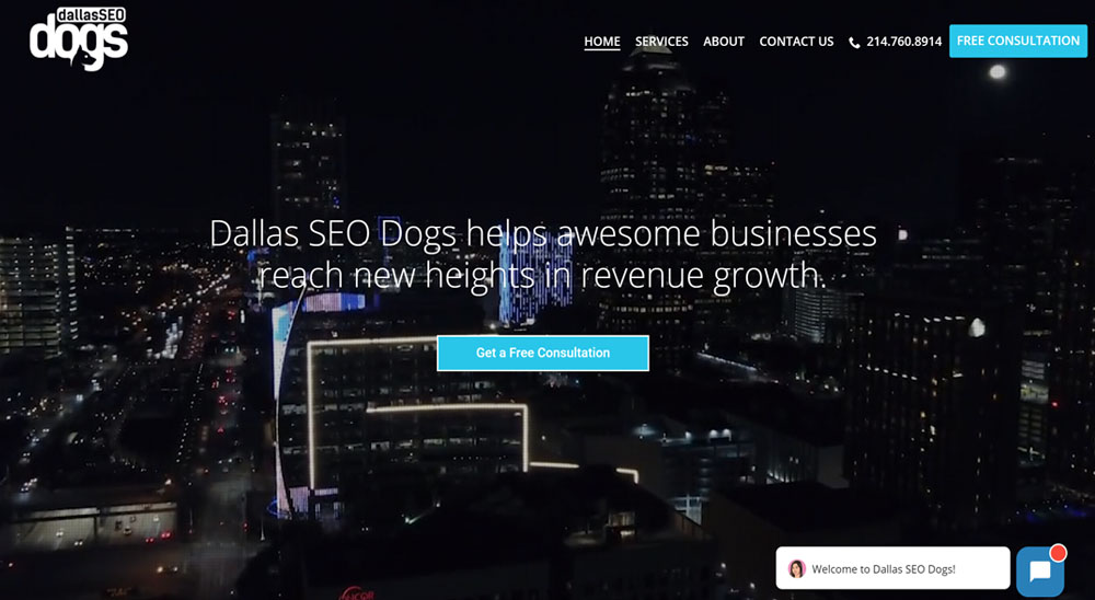
Visuals in-motion catch your visitor’s eye. With 2019’s technology, it is possible to use video backgrounds on desktop devices to increase conversions and (if done properly) without slowing down your page speed. The key is to keep the duration (<10 seconds) and file size (~1 MB or less) low. Remove the video or display an image for mobile users.
Video lets you quickly and effectively convey a message or create a mood. With a video playing in your background, users are less likely bounce and more likely to be interested in finding out more about your brand and what you offer. This is just enough time to change someone’s mind and have them clicking “purchase” on your product.
Get Your New Year Designed Right With Big D Creative
When you set out to build a site that has all of the elements it needs to succeed, professional experience is necessary. Big D Creative is a Dallas-based design company that regularly stays ahead of design trends and ensures that the sites we create appeal to your audience and search engines alike.
If you know it’s time for a new site or just a face-lift that really pops, reach out to us today. Our team can’t wait to show you how we can make your brand memorable.


